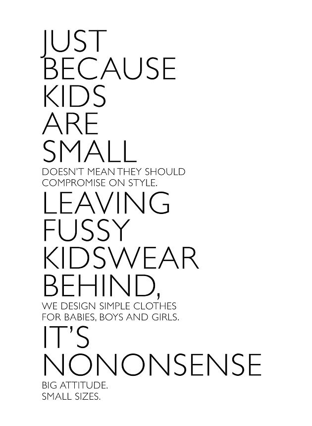
Big attitude, small sizes.
It's Nononsense.
It's Nononsense.
The brand NONO has a great approach to kids clothing, beautifully designed collections and since 2009, it also has a point of view.
STARTING POINT
What started as a product branding exercise for NONO turned into a reconnection with it's roots. Whilst trying to understand the essence of the brand in the beginning phase, we discovered that the name actually came from "a no-nonsense approach to kid's fashion", the philosophy behind the product development. However we couldn't find it back in the brand. We presented the re-branding case to NONO's team who right away agreed that it was the logical first step and the right thing to do.
THE APPROACH
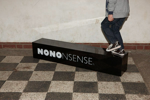
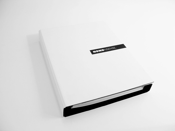
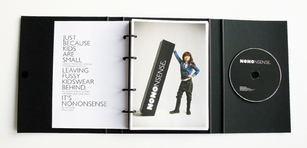
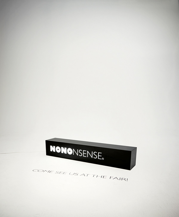
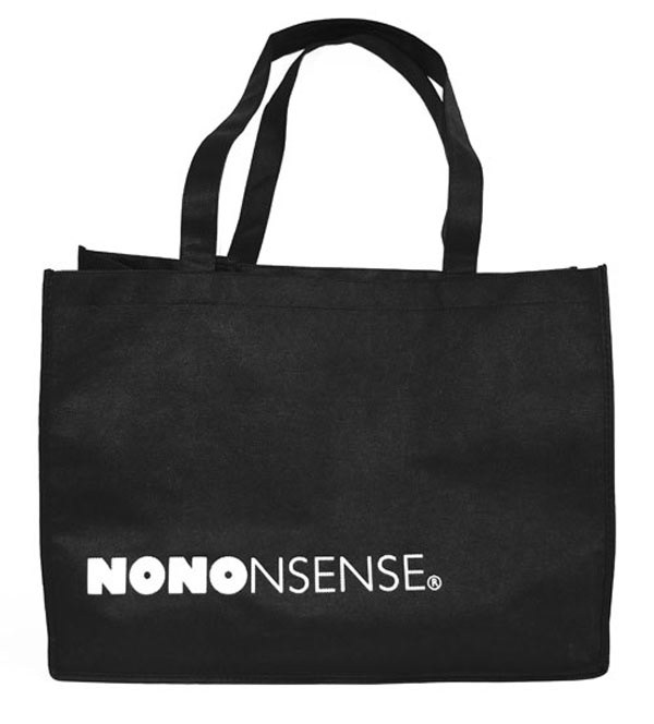
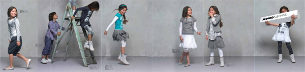
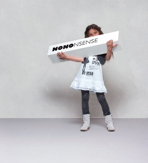
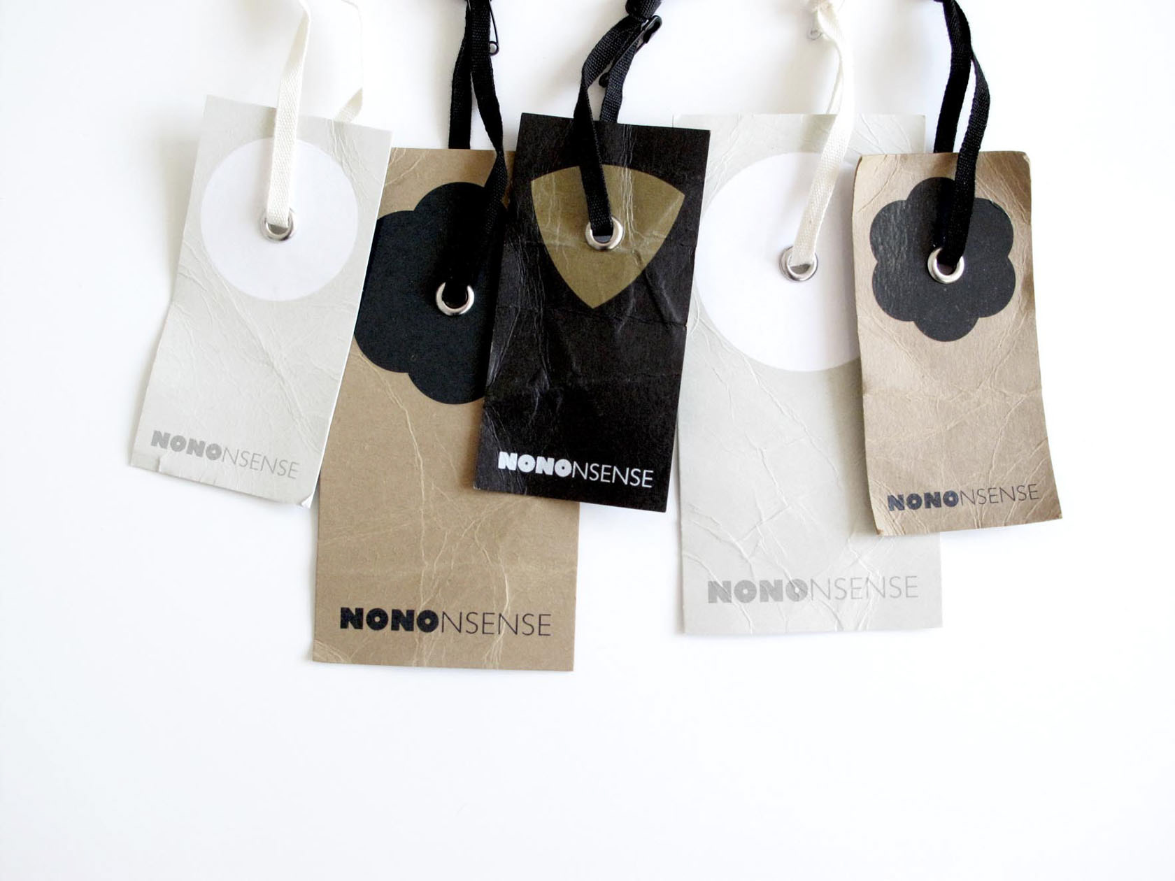
The idea was to communicate the name and the attitude at the same time so we kept the old logo (NONO) almost as it was and connected "NSENSE" to it in a lighter weight to separate them yet create a mark/pay-off type of logotype. And with such a name, the attitude had to be taken up a notch so we've developed a narrative and a tone of voice to match the promise.
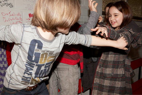
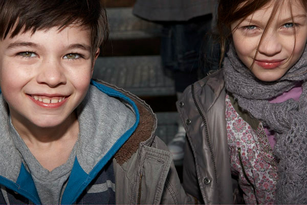
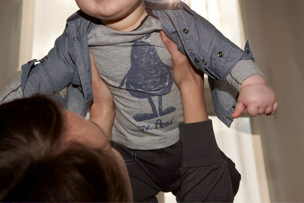
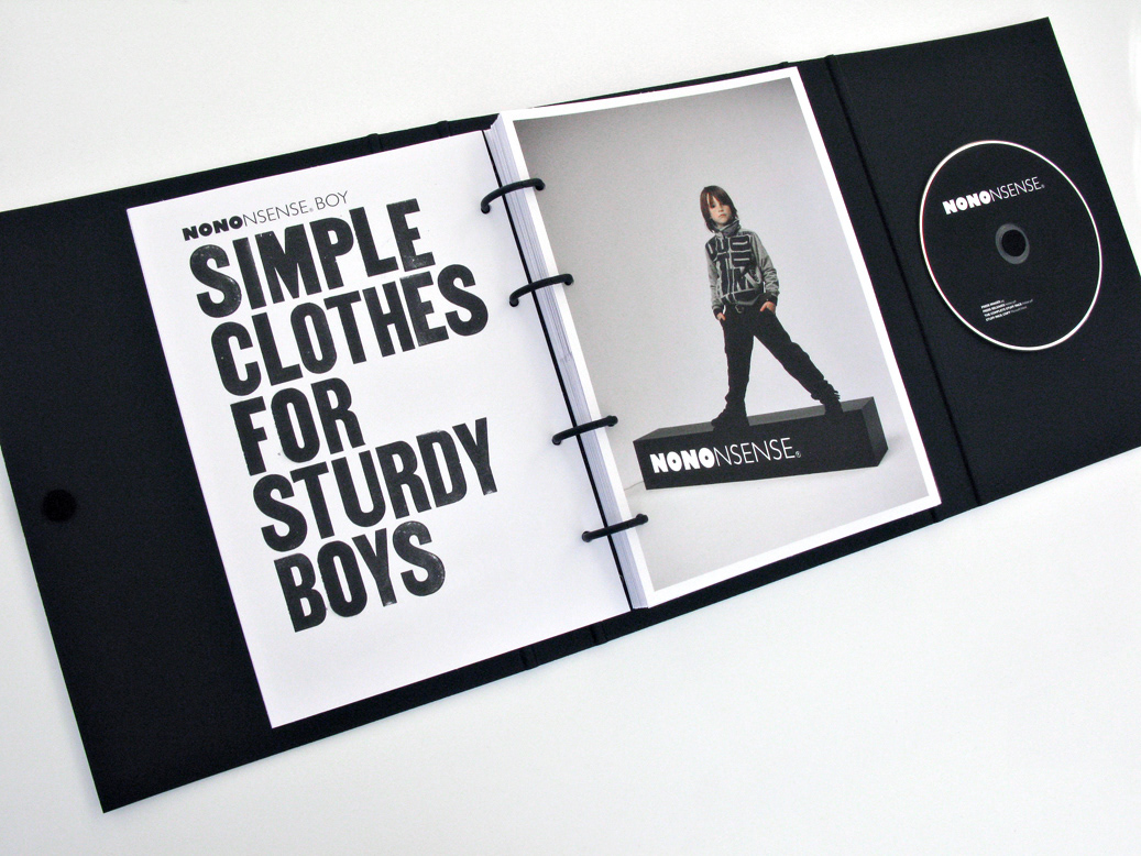
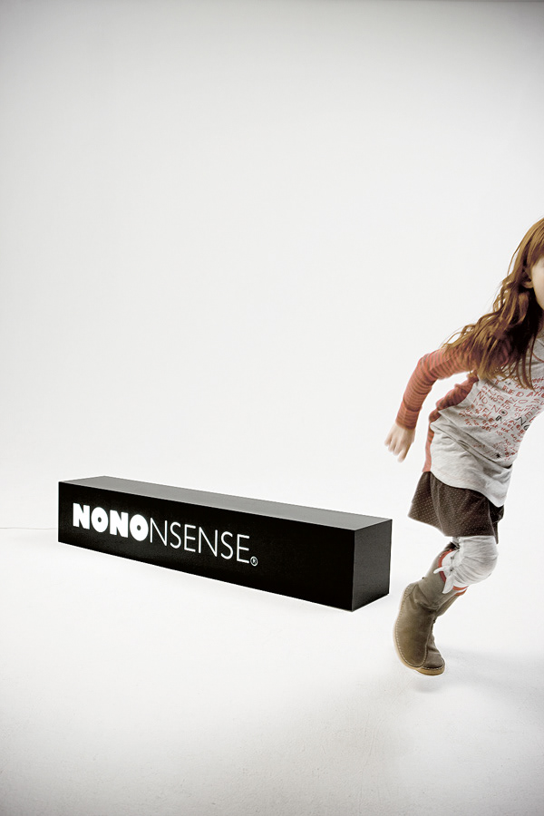
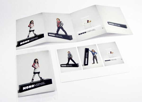
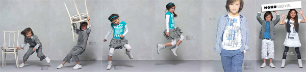
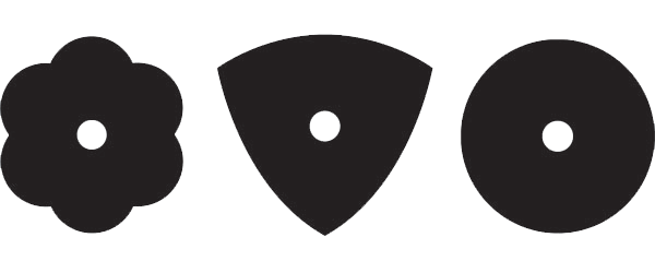
The boys, the girls and the babies each got their own representative icon and typeface and the no-nonsense black became the base colour for all. The photography also took a no-nonsense turn and depicted true kids stuff and attitude.
Above all, the brand has reconnected with its origins and brought back no-nonsense as the brand’s driver.
The result is a change of name, a new positioning & identity, a confident attitude, and, most importantly, a single, unique point of focus for all levels of the organisation.
STARTING POINT
What started as a product branding exercise for NONO turned into a reconnection with it's roots. Whilst trying to understand the essence of the brand in the beginning phase, we discovered that the name actually came from "a no-nonsense approach to kid's fashion", the philosophy behind the product development. However we couldn't find it back in the brand. We presented the re-branding case to NONO's team who right away agreed that it was the logical first step and the right thing to do.
THE APPROACH
The idea was to communicate the name and the attitude at the same time so we kept the old logo (NONO) almost as it was and connected "NSENSE" to it in a lighter weight to separate them yet create a mark/pay-off type of logotype. And with such a name, the attitude had to be taken up a notch so we've developed a narrative and a tone of voice to match the promise.
The boys, the girls and the babies each got their own representative icon and typeface and the no-nonsense black became the base colour for all. The photography also took a no-nonsense turn and depicted true kids stuff and attitude.
Above all, the brand has reconnected with its origins and brought back no-nonsense as the brand’s driver.
The result is a change of name, a new positioning & identity, a confident attitude, and, most importantly, a single, unique point of focus for all levels of the organisation.

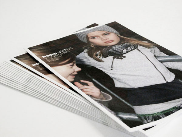
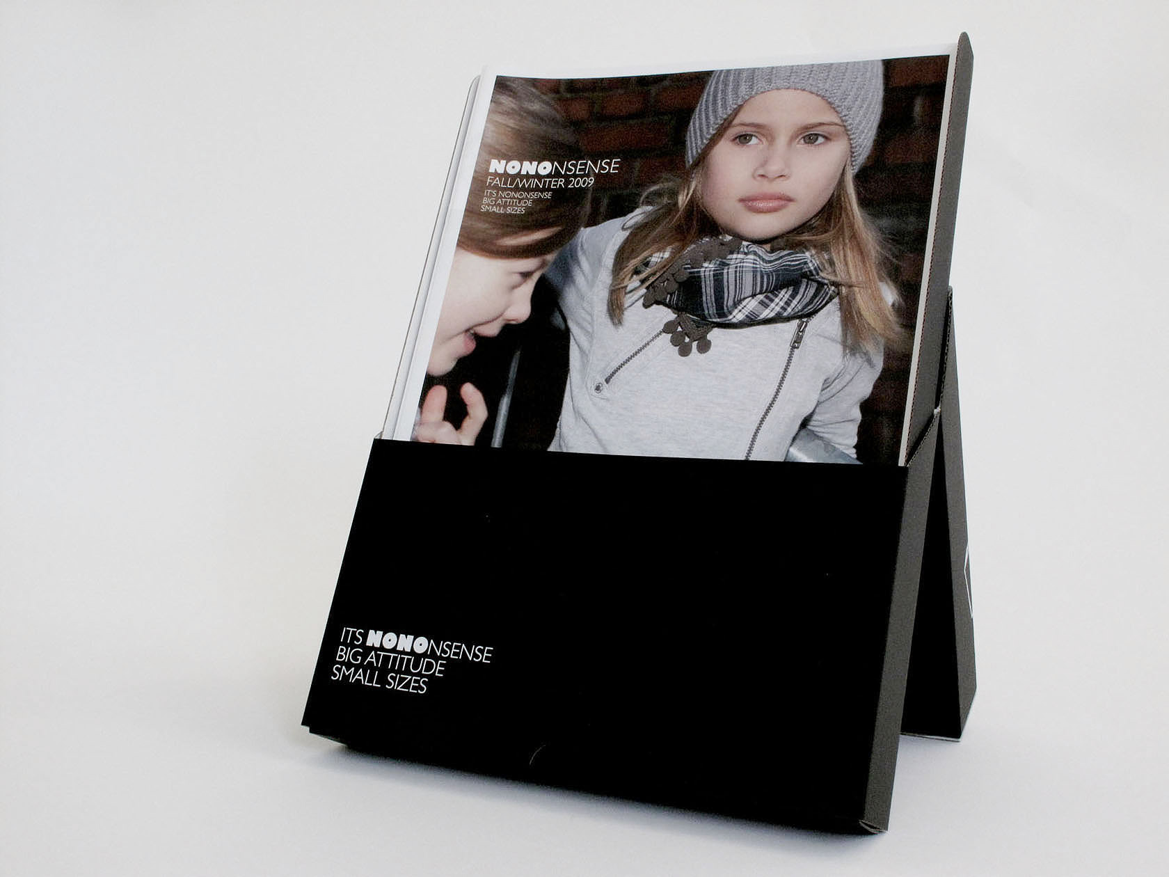
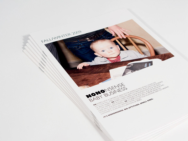
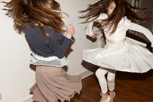
Photos: Achim Lippoth